The Carbon Map - Climate Hub
- Summary
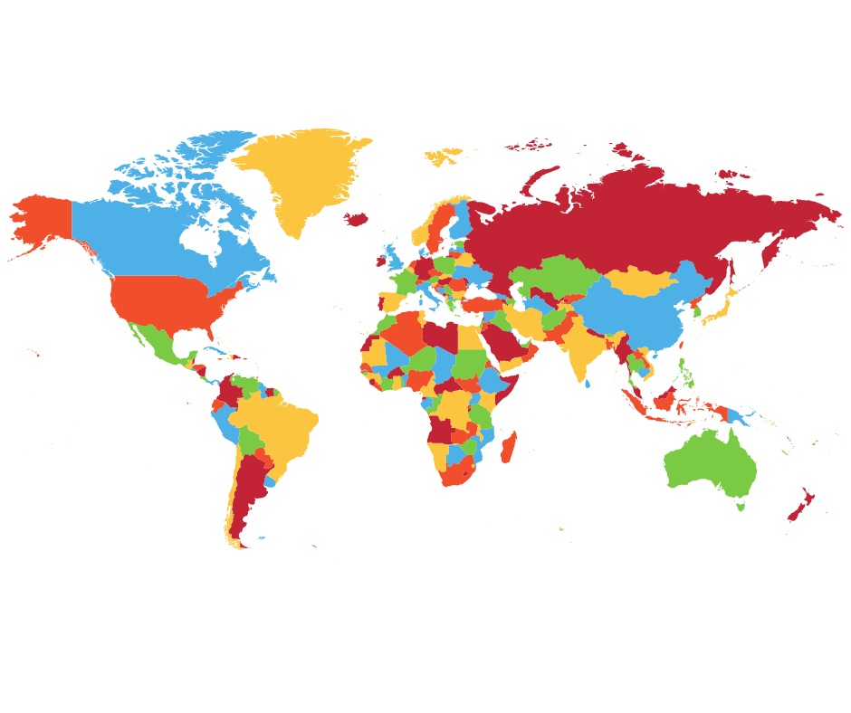
- The Carbon Map represents how different countries fit into the picture of climate change, through animated, distorted versions of a map of the world.
- Image or logo
-

-
Climate change responsibility is a complex issue. It cannot be represented only through current national emissions. This website displays an interactive, animated map to help convey how different countries fit into the climate change picture – both the causes and the risks.
It distorts the map of the world based off varying factors, i.e. country size, population size, historical emissions
Click on the website below to discover multiple ways of looking at carbon emissions.
- Website
- https://www.carbonmap.org/#intro

